
Scrolling an Excel Chart: Replaying Logged Data
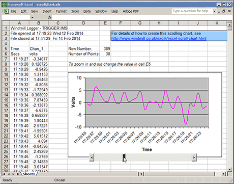
When repeatedly making measurements you can very quickly collect a vast amount of data. There are times when you might want to replay the data as a moving chart. You can do this with Excel, creating a chart which you can scroll through. The speed the chart moves depends on how fast you drag the scroll bar control. Our explanation of how to do this below will probably be easier to understand if you download our example spreadsheet from http://www.windmill.co.uk/scrollchart.xls.
Our solution makes use of dynamic named ranges and the fact that you can link a scroll bar to a cell, where scrolling causes the cell's value to change.
Say you have imported a Windmill Logger file into Excel which has time in the first column (A) and voltage readings in the second column (B). You want to chart the voltage signal against time.
Defining Dynamic Ranges with the Offset Function
First you need to define two dynamic ranges. To do this we're going to use the Offset function, which returns a cell reference according to your settings.
To create our ranges:
- From the Insert menu choose Name then Define.
- Type Time into the Names box and
=OFFSET(Sheet1!$A$6,Sheet1!$E$5,0,Sheet1!$E$6,1)
into the Refers to box.
Click Add.
- Type Signal into the Names box and
=OFFSET(Sheet1!$A$6,Sheet1!$E$5,1,Sheet1!$E$6,1)
into the Refers to box.
Click Add.
- Click OK.
This is the syntax of Offset:
OFFSET(reference, rows, cols, height, width)
Reference is the location from which you want to base the offset. In our example this is the leftmost cell immediately above the data: A6.
Rows and columns define how far away the offset is from the reference cell. We want the row number to change as we scroll the chart, so we don't use an absolute value for rows. Instead, we'll put the rows value into cell E5, and link this to the scroll bar.
Columns tells us whether we are referring to time column 0) or voltage (column 1) readings.
In our example, height is the number of rows of data to be displayed at any one time on the chart. That is, the number of data items to be shown. We could enter a number for this, 30 say. However, if we enter the height value into a cell and reference that, we can then change this value and zoom in and out of the chart. We'll use E6 to store the number of data points to be displayed.
Finally the width value. This is the number of columns of the returned reference, or, in our example, the number of data series in the chart. For our chart this is 1.
Entering the Row Number and Data Points to be Displayed
We now need to set our row number (E5) and number of data points displayed (E6). Enter 1 into E5 and 30 into E6. (Remember, dragging the scroll bar will change the value in E5 and hence the row of data displayed.)
Creating the Chart
We can now create the chart.
- From the Insert menu choose Chart.
- Select Line as the Chart type and press Next.
- Click the Series Tab. Press Add. Type into the boxes as follows:
Name: Chan_1
Values: =Sheet1!Signal
Category (X) axis labels: =Sheet1!Time
You should see a chart of the first 30 data values.
You now need to fix the y axis, so it doesn't expand or contract when another set of data is shown.
- Right-click the y axis.
- Select Format axis and the Scale tab.
- Clear all the auto boxes and make sure that the maximum and minimum values span your data. In our example these are +10 and -10 (Volts).
Inserting the Scrollbar
The next step is to insert a scrollbar control.
- From the View menu select Toolbars and show the Control Toolbox.
- Click the scrollbar control. (Click off the chart to do this.)
- On the worksheet, drag the scrollbar to the size you want.
- Right-click the scrollbar and select properties.
- Enter E5 as the Linked Cell.
- Set the minimum value to be 1 and the maximum value to be the number of rows of data you have.
- Click the Set-Square and Pencil icon on the Control Toolbox to exit Design mode.
Zooming Into the Chart
To zoom into the chart simply change the figure in E6: the number of data points displayed. The less data points the greater the magnification and vice versa.
Further Reading
Our method is a modified version of Andy Pope's scrolling chart example
http://www.andypope.info/charts/Scrolling.htm
Other Excel Charting Tips
http://www.windmill.co.uk/excel/excel-charting.html
Our Monitor newsletter (ISSN 1472-0221) features a series of Excel Corners, giving hints and tips on using Excel. To subscribe to Monitor fill in your e-mail below.