
Charting with Excel
This article gives tips on charting with Excel for scientific, engineering or manufacturing applications. It deals with how best to present data once you've collected it from measurement instruments, devices and sensors.
Choosing the Type of Excel Chart | Charting Questions Answered
Choosing the Type of Excel Chart to Use
Excel provides a multitude of chart styles and it can sometimes be confusing which one is the best to use. Here we highlight three well suited to data acquisition applications - stock chart, bar & column chart and xy scatter chart.
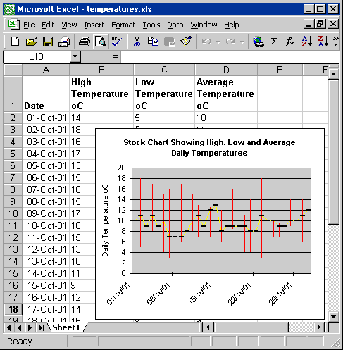
Stock Chart: Useful for Displaying High, Low and Average Readings
A stock chart shows high, low and close data. This is designed for plotting stock market movements, but can be useful when plotting, say, daily temperatures. To plot the temperature range for each day you would have the date in the first column, the highest temperature of the day in the next column, the lowest temperature in the third column, and, for example, the average temperature of the day in the fourth column - replacing the stock market close data.
Column and Bar: Good for Displaying Counts
Column and bar charts are useful for comparison of discrete measurements made at regular intervals. For example, if you were counting people entering a building, you might use a column chart to show count totals for a series of days or weeks. To display data from several buildings you could use a stacked column chart, where figures for each building are shown as a part of the total column count.
A column chart has time on the horizontal x-axis and a bar chart time on the vertical y-axis. If you have too many columns, Excel won't display all the column labels. Displaying data in bars removes this problem.
Line Charts Versus xy Scatter
You would usually use an xy scatter chart in preference to a line chart. With xy scatter an independent variable is plotted on the x-axis and variables dependent upon this plotted on the y-axis. When you add a trend line, you can see the relationship between the variables. For example you might see a linear relationship between the concentration of a compound in solution and its absorbance of light.
With Line charts the x values are more like labels than values. They are spaced equally, no matter what their value. Using our above example, suppose you plotted absorbance against the concentration of four solutions of 0, 1, 2 and 6 mM. With xy scatter the line will be straight as the 6mM point is plotted in its correct position 4 units away from the 2 mM point. With a line chart the 6mM point is plotted just 1 unit away from the 2 mM point, giving a steep rise in absorbance and thus non-linear graph.
Frequently Asked Questions About Charting Windmill Data with Excel
Can I Quickly Add None-Adjacent Columns of Data to an Excel Chart?
- Move the mouse pointer over the edge of the highlighted data, so it changes to an arrow
- Click and drag the column onto the chart.
How can I overlay scatter and stock charts?
How do I label individual points on scatter charts?
How do I set a chart to automatically update?
Can I set the chart ignore empty cells and zeroes?
How to Plot Random Samples against Time?
How do I get a log x axis and log y axis on the same chart?
How do I add several y axes to a chart?
How to find a y value from a known x value on an xy scatter chart?
Can I scroll an Excel Chart?
How do I zoom into an Excel Chart?
How do I show only recent data in a Chart?
How do I create a histogram?
How do I annotate a chart?
How do I mark an external event on a chart?
How can I paste an Excel chart as a Picture in a Report?
How do I plot one variable against another on a Column Chart?
How do I Insert a Chart with a macro?
Can I add a grid line that moves with the last chart value?
How do I add alarm markers to a chart?
How do I add maximum, minimum and average grid lines to a chart
How do I make a logarithmic chart?
Plotting Data Sets with Different Timestamps
How do I create a carpet or 3D surface plot
Another Question?
More Information
- Our Monitor newsletter (ISSN 1472-0221) features a series of Excel Corners, giving hints and tips on using Excel. To subscribe to Monitor fill in your e-mail below.
- Read our tips and tricks on using Excel with laboratory instruments and industrial devices.